
Designing a small living room can be a challenge, especially when it comes to choosing the right color palette. Low contrast color palettes can create a serene and spacious feel, making a small room appear more open and inviting. Here, we explore the benefits of low contrast colors and provide practical tips for implementation.
1. Understanding Low Contrast Color Palettes
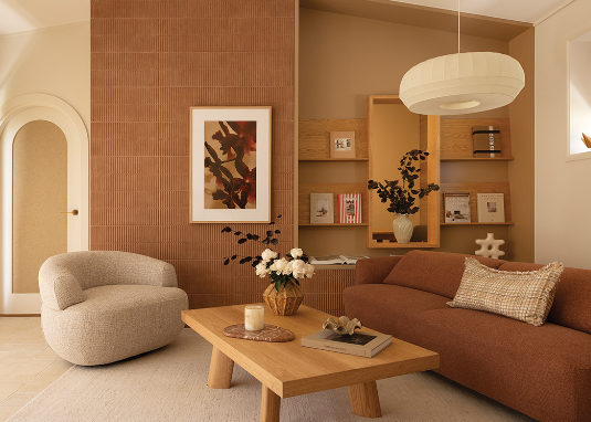
Low contrast color palettes consist of shades and hues that are closely related on the color wheel. This approach creates a harmonious look and can help unify various elements in a small living room. For example, pairing soft grays with gentle whites or muted blues with dusky greens can lend an air of tranquility that larger spaces may not require.
Essentially, low contrast colors work to minimize visual clutter, allowing your living room to feel more cohesive and spacious. Spaces painted in low contrast shades often appear less frenetic and more collected, offering a welcoming atmosphere. For instance, using a pale cream for the walls and pairing it with similarly soft furnishings can become a simple yet effective design choice.
-
- Select hues that are within a few shades of each other.
-
- Test samples on your walls to see how different light affects them.
-
- Create a mood board to visualize your potential color combinations.
-
- Incorporate different textures to add depth without increasing contrast.
2. Choosing the Right Colors for Your Space
When selecting low contrast colors for your small living room, consider the natural light that enters the space. Bright rooms can afford slightly darker shades, while dimly lit rooms may benefit from paler palettes to keep the atmosphere airy. Soft tones such as blush pink paired with off-white can create an inviting environment that feels larger than it is.
Neutral colors, such as taupes and soft beiges, also work exceptionally well in low contrast schemes. These can be coupled with lightly patterned textiles or gently textured furniture, adding interest without overpowering the subtle palette. Adding accent pieces like artwork or vases in slightly contrasting but closely related shades can add personality while still keeping the overall look cohesive.
-
- Use color swatches to ensure they complement the natural light in your room.
-
- Consider the mood you want to create — calming or energizing?
-
- Choose a dominant color, then select lighter and darker tones of that color for coordination.
-
- Incorporate variations in texture to keep your space visually engaging.
3. Implementing Low Contrast Elements in Your Design
Once you’ve selected a color palette, it’s time to implement it within your living room. Start with the walls and floors, using lighter shades to expand the perceived space. For instance, a soft, matte finish gives walls a clean look while eliminating bothersome reflections from natural light.
Next, consider your furniture and accessories. Opt for sofas or chairs in a muted shade, such as light gray, paired with cushions of a similar but slightly varied color—like off-white or pastel tones. This layering effect will maintain the low contrast ethos, ensuring everything feels intentionally curated rather than mismatched.
-
- Choose matte finishes for walls to avoid reflection and maintain softness.
-
- Layer different textures (fabrics, woods, metals) to create visual interest.
-
- Balance the room with large, impactful pieces that embody your color scheme.
-
- Add greenery through plants to introduce a lively touch without overwhelming contrast.
4. Accent Features in Low Contrast Living Rooms
In a low contrast color palette, accents can play a significant role in adding dimension without drawing too much attention. Consider furniture with curved edges or light wood grains that can soften the look even further. Choosing art frames or light fixtures in similar hues can unify the space, maintaining that calming aesthetic.
When adding decor items, think of the overall scheme you’re trying to achieve. Art pieces with soft watercolor designs can enhance the aesthetic while remaining subtle. You might also use a monochromatic rug to ground the space without offering high visual contrast, allowing other elements to shine in a more understated way.
-
- Incorporate decorations that share similar tones with your wall color.
-
- Use plants as natural decor that complements the low contrast scheme.
-
- Keep furniture choices minimal and functional to maintain a clutter-free space.
-
- Consider using layered lighting to create different moods without harsh contrasts.
In conclusion, utilizing low contrast color palettes in small living rooms can help create a calm, spacious atmosphere that feels inviting. By carefully selecting your colors, furnishings, and accents, you can transform your small space into a cohesive haven of comfort. Start experimenting with low contrast palettes today, and enjoy the refreshing shift in your living room’s ambiance!